Quality Report
This article introduces all the updates in CYF’s new Quality Report. With a more modern visual interface, data unification, and interactive features, it’s now even easier to track operational quality results.
Below, you’ll understand each section of the new report, how to access it, and how to use all the features—even if it’s your first time.
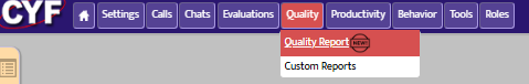
✅ How to access the new Quality Report
- From the system’s sidebar menu, click the “Quality” tab.
- Then, select the “Quality Report” option.
The full report will open:
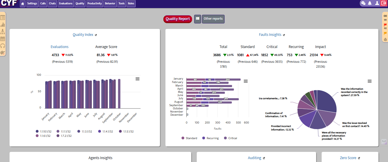
📈 Quality Index
What is it?
The Quality Index section centralizes your operation’s main indicators in one interactive dashboard. The goal is to enable complete analysis by period, team, supervisor, and agent—quickly and clearly.
Graphical View: Interactive Dashboard
When accessing the Quality Index panel, users see modern, intuitive graphs that allow easy tracking of operational performance.

Main visual features:
- Modern, adaptive interface:
The graphs adjust to the screen and show only the most relevant data, avoiding information overload. - Supervisor view:
Monthly comparison between each supervisor’s teams—ideal for leaders to quickly identify performance changes. - Automatic period comparison:
When selecting a year (e.g., 2025), the system displays comparative data with the previous year (e.g., 2024), making it easy to track index evolution. - View toggle (daily, weekly, or monthly):
Data can be viewed by day, week, or month. The system automatically adjusts the layout to ensure a clear and efficient display.
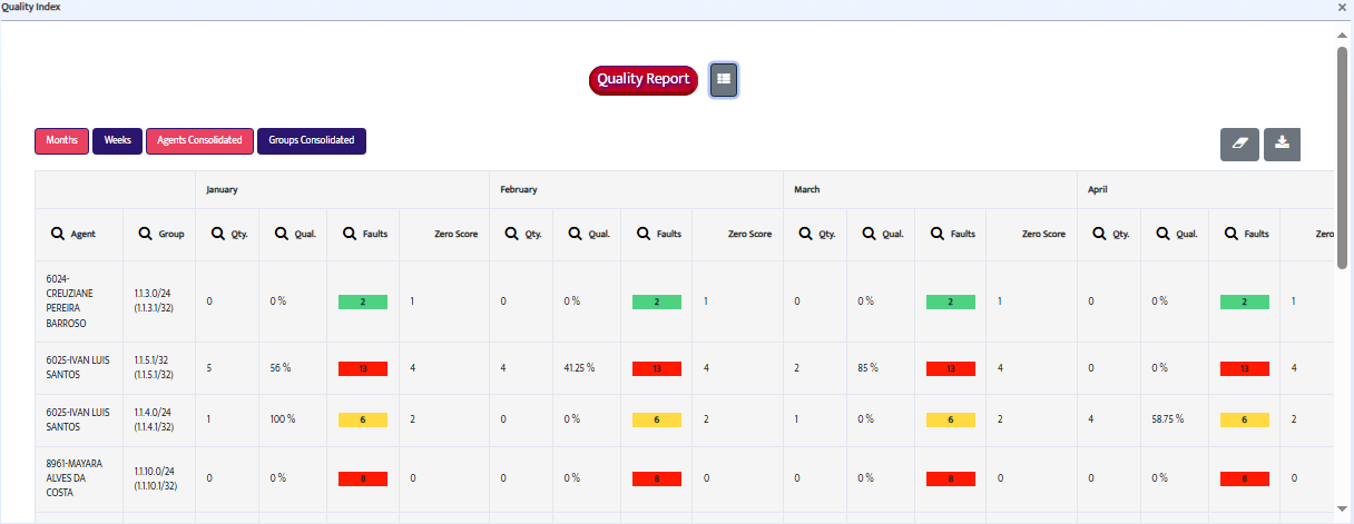
Table View: Agent Details
Below the graphs, the panel shows dynamic tables with specific information for each employee, offering a detailed and easy-to-navigate view.

Details available in the table:
- Individual quality index
- Number of evaluations conducted
- Number of recorded errors
- Number of zero-score evaluations
You can sort or filter the columns to simplify analysis based on different criteria.
👥 Group View
In addition to the agent view, the panel also offers a consolidated group view, grouping the data by supervisor.
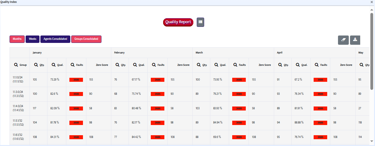
This view shows:
- Average quality index by group
- Total number of errors
- Other team performance indicators
Ideal for managers who need a macro view of the operation before diving into individual data.
This panel provides a complete and customizable analysis of your operation’s quality, supporting strategic decisions and continuous improvement plans.
📉 Faults Report
What is it?
The Faults Report allows you to understand in more depth the errors made during monitored interactions. It details the number, type, impact, and author of the failures, making it an essential tool for targeted corrections and continuous improvement.
Graphical View: Faults Insights
When accessing the report, users see an interactive chart under the title “Faults Insights.” This chart provides a quick and strategic overview of the recorded error scenario.
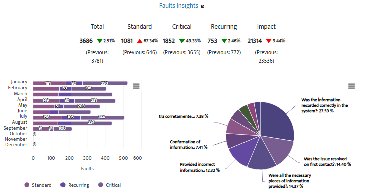
Displayed insights include:
Types of registered faults:
- Regular: Faults with normal weight in the final score.
- Critical: Faults that automatically drop the score to zero.
- Recurrent: when the same agent commits the same faults two or more times in the same item during the analyzed period.
Metrics available in the chart:
- Total faults by period
- Percentage impact by item
- Highlight of critical faults (red alert icons)
Table View: Advanced Filters
Below the chart is a detailed table with intelligent filters for in-depth investigation.
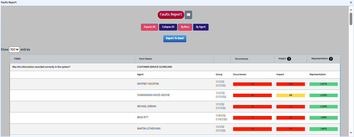
Available filters:
- By item: see which criteria are the most problematic throughout the operation.
- By agent: identify the professionals who make the most mistakes and in which items.
Detail expansion:
Clicking a row in the table allows you to:
- See which agents made the most faults in a specific item
- View the main faults committed by each agent
This combination of chart and table turns the Faults report into a powerful ally for guiding feedback, training, and improvements.
🏆 Ranking – Top 10 Best and Worst Agents
What is it?
The ranking displays the top 10 best and worst-performing agents based on the Quality Index during the selected period.
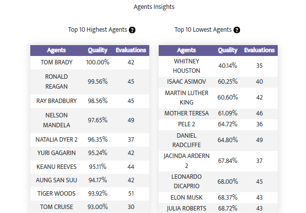
Rules to appear in the ranking:
- Only agents with a number of evaluations equal to or above the operation’s average are shown.
This prevents distortions from small sample sizes and ensures data reliability.
Displayed information:
- Agent’s name
- Number of evaluations received
- Average quality index
This view allows you to:
- Recognize high-performing team members
- Take action with agents who need support
- Make managerial decisions based on real, objective data
📞 FCR Indicator (First Contact Resolution)
The FCR Summary allows you to clearly track how your operation is performing on this metric, showing the total number and monthly average of contacts resolved on the first attempt.
After applying the filters, the indicator will be displayed like this:
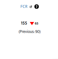
Currently, the available type is “Call” (telephone contact). However, if your operation has other channels configured, data from chat, email, or in-person service may also appear.
Clicking the icon next to “FCR” will open the full evaluation report.
📊 What does the indicator show?
- Monthly average of FCR
- Number of evaluations with FCR marked
- Breakdown by contact type (if available)
✅ What is this indicator for?
- Assess efficiency in resolving contacts
- Identify drops or improvements in resolution rate
- Support strategic decisions to improve customer experience
- Track FCR goals in real-time using reliable data
💡 Tip:
This indicator depends on manual marking in the evaluation form, so it’s important that analysts are trained to correctly flag interactions resolved on the first contact.
Auditing Indicator
The Auditing feature in CYF Quality was created to ensure consistency and quality in the evaluations performed by quality monitors. Through this functionality, an auditor can review and correct the points made in evaluations, contributing to more reliable analyses and decision-making.
🔍 How does the Auditing process work?
- A quality monitor performs a standard evaluation.
- An auditor accesses that evaluation and can review, adjust, and justify any item or score given.
- Once the auditor completes the review, the evaluation is marked as “audited” and its data automatically feeds into the Auditig Indicator.
📊 What does the Auditing Indicator show?
The Auditing Indicator provides consolidated information about all audited evaluations, enabling monitoring of the quality and consistency of assessments conducted by the team.
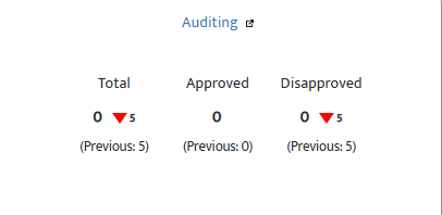
After clicking the icon next to “Audit”, filter the contact date. The system will then display:
- Number of audited evaluations per selected period
- Names of the monitor and auditor involved
- Divergence rate between the original and the final audited score
- Most frequently corrected items in the evaluations
- Justifications provided by the auditor for each adjustment
- Quality trend of evaluations over time
🎯 Benefits of the Auditing Process
- Ensures standardization and fairness in evaluations
- Identifies areas of concern in the monitor’s performance
- Improves agents’ confidence in the evaluation process
- Supports more accurate training and feedback initiatives
📌 Important Note
Auditing can only be performed by users with auditor permissions. These users can justify all changes made and ensure full traceability for each modification.
📊 Calibration Indicator
This indicator was designed to show the alignment level between evaluators based on data from calibration sessions performed by authorized groups.
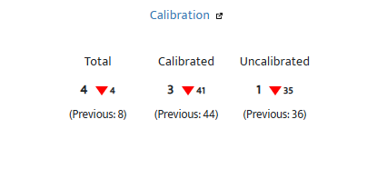
Clicking the icon next to “Calibration” and selecting a date will display:
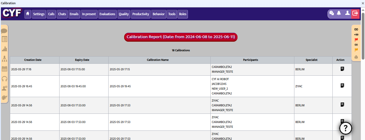
🔍 What is shown?
- Total number of calibrations
- Calibrated contact channel
- Calibration expert
- Form used
- Score deviation by item
- Average score from participants and the expert
- Alignment index (%)
- Calibration status: pending, in progress, or completed
- Participants and deadlines
📈 Interpretation:
- A score near 100% indicates good alignment
- A low score suggests misalignment or training needs
- Average deviation helps identify critical items
This indicator is key for ensuring standardization, improving evaluation quality, and guiding training with real evidence.
⚠️ Zero Score
Zero-score evaluations occur when the agent makes a critical error configured to automatically nullify the entire evaluation.
This indicator appears inside the quality report.
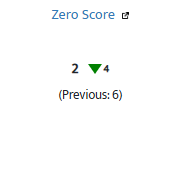
Clicking the filter icon next to “Zero Score” displays the affected contact and its information.
🎯 Why is it important?
- Identifies agents with serious mistakes
- Triggers urgent training actions
- Evaluates high-risk failures
💡 Tip: configure critical failures carefully so that zero scores reflect only truly severe cases.
📩 Need help?
If you have questions or need support with the Quality Report, contact our support team:
📧 support@cyf.com