Productivity Report
The Productivity Report is designed to demonstrate and analyze the performance of monitors, supervisors, and managers. It consolidates evaluation data to track and understand both individual and collective productivity for these users.
How to Access
Go to: https://quality.cyf.com/login.php
In the side menu, click on “Productivity” and then “Productivity Report”.

Available Filters
Dropdown Filters
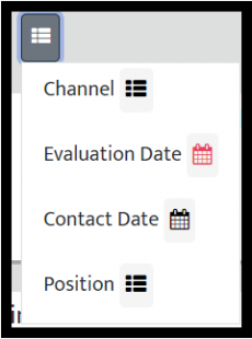
- Service Channel (Channel)
Choose the channel type (Call, Chat, Email, or In-person). - Evaluation and Contact Date
Set the time range: Today, Last 7 Days, This Month, or select a custom date range. - Position
Filter by: Monitor, Supervisor, Manager, or General Monitor.
Special Filter: Consolidate All Operations
This filter allows you to unify information from all operations into a single report. With it, you no longer need to access each operation individually to extract data — everything is consolidated into a single view, making analysis easier and saving time.
How to use it:
In the Productivity Report, select the filter “Consolidate All Operations”.
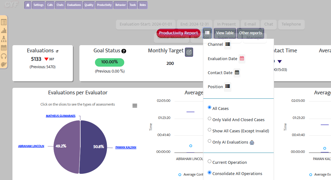
The filter will then appear as shown in the image below.
Graphic and KPIs
Visualization
The graphic and KPIs provide a quick and clear view of:
- Productivity
- Feedback quality
- Goal achievement
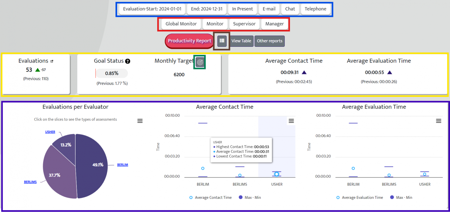
Colors and Functions in the Report
| Color | Meaning |
|---|---|
| 🔵 Blue | Applied filters (evaluation/contact date and selected channels) |
| 🟠 Orange | User category filter (monitor, supervisor, manager) |
| 🟤 Brown | Type of date used: evaluation or contact |
| 🟡 Yellow | Main KPIs (time, quantity, goals) |
| 🟢 Green | Monthly evaluation goal settings |
| 🔴 Red | Link to the Evaluation Report |
📊 KPIs (Key Performance Indicators)
| Indicator | Description |
|---|---|
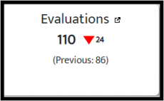
| Evaluations
|
Total number of evaluations completed during the selected period |
| Goal Status | Percentage of the monthly goal achieved |
| Monthly Goal | Target number of evaluations set |
| Average Evaluation Time | Average time taken to complete an evaluation |
| Average Contact Time | Average duration of the evaluated interactions |
Detailed Graphic
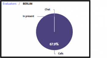
- Evaluations by Evaluator
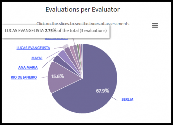
- Total number of evaluations completed by each evaluator.
- Interactive: Hover to see individual details.
- Click to break down by channel.
– Download available.
- Graphic: Average Contact / Evaluation Time
- Average Contact Time: Average duration of evaluated interactions.
- Average Evaluation Time: Average time taken to complete evaluations.
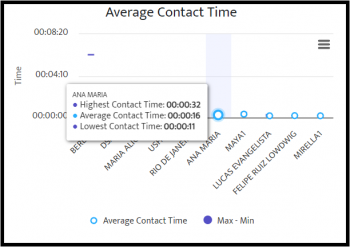
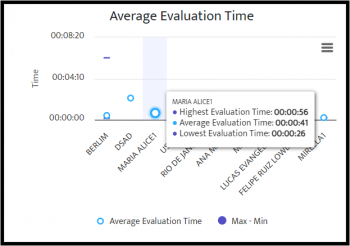
Difference Between Indicators
- Average Evaluation Time measures the time taken by the evaluator.
Average Contact Time measures the time of the person being evaluated.
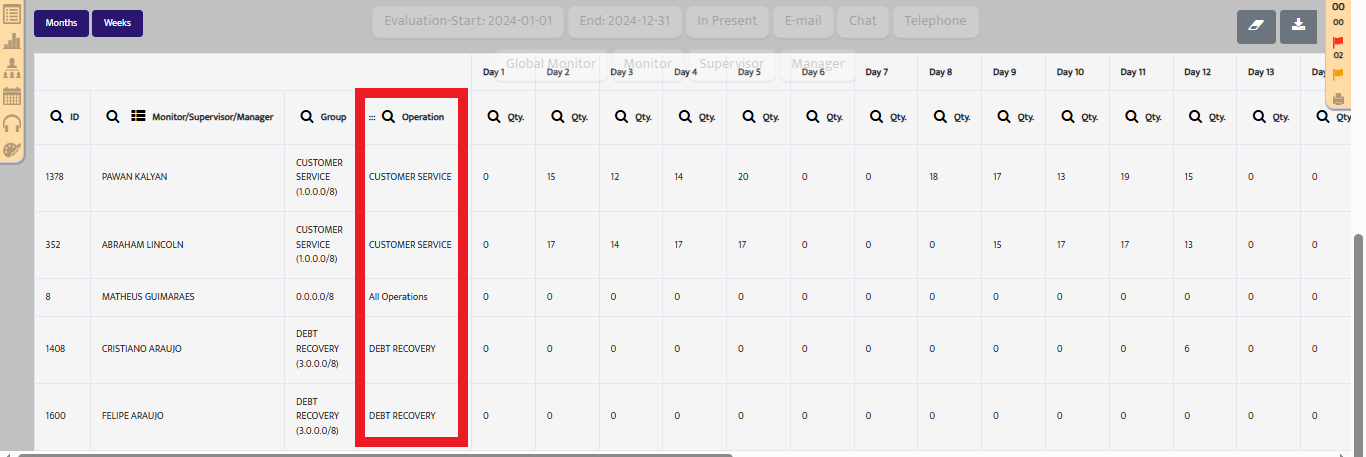
📋 Pivot Table
Displays detailed data by user, and can be viewed by day, week, month, etc.
| Column | Description |
|---|---|
| ID | User identification number |
| Position | Role: Monitor, Supervisor, etc. |
| Group and Operation | Work area and operation |
| Evaluations (Qty) | Number of evaluations completed |
| Goal Achievement (%) | Percentage of goal achieved |
| Quality Index | Average evaluation quality score |
| Evaluation Duration | Average time spent per evaluation |
| Call Duration | Average duration of evaluated calls |
If you have any further questions, please contact our support team:
📩 support@cyf.com